CYGNUS Game UXUI
UI Core Interface Iteration
Dated To 2020-2022
Part 1
Cygnus Enterprises
From 2020 I am working on Cygnus Enterprises in Netease as a UX Designer. From this portfolio, I wanna show more details about how we break down iterations and finalize the implementation.
website:

GamePlay Features
Base Construction
Reclaim and expand a derelict outpost on an alien planet.

Employee Management
Manage your team of employees to develop new products and generate revenue.

Face New Challenge
Traverse exotic locations and defeat hostile entities on your mission to help Mytilus thrive.
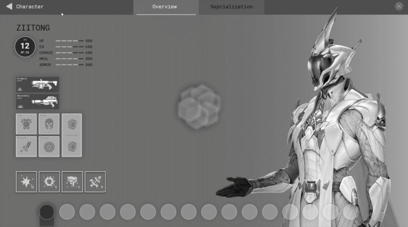
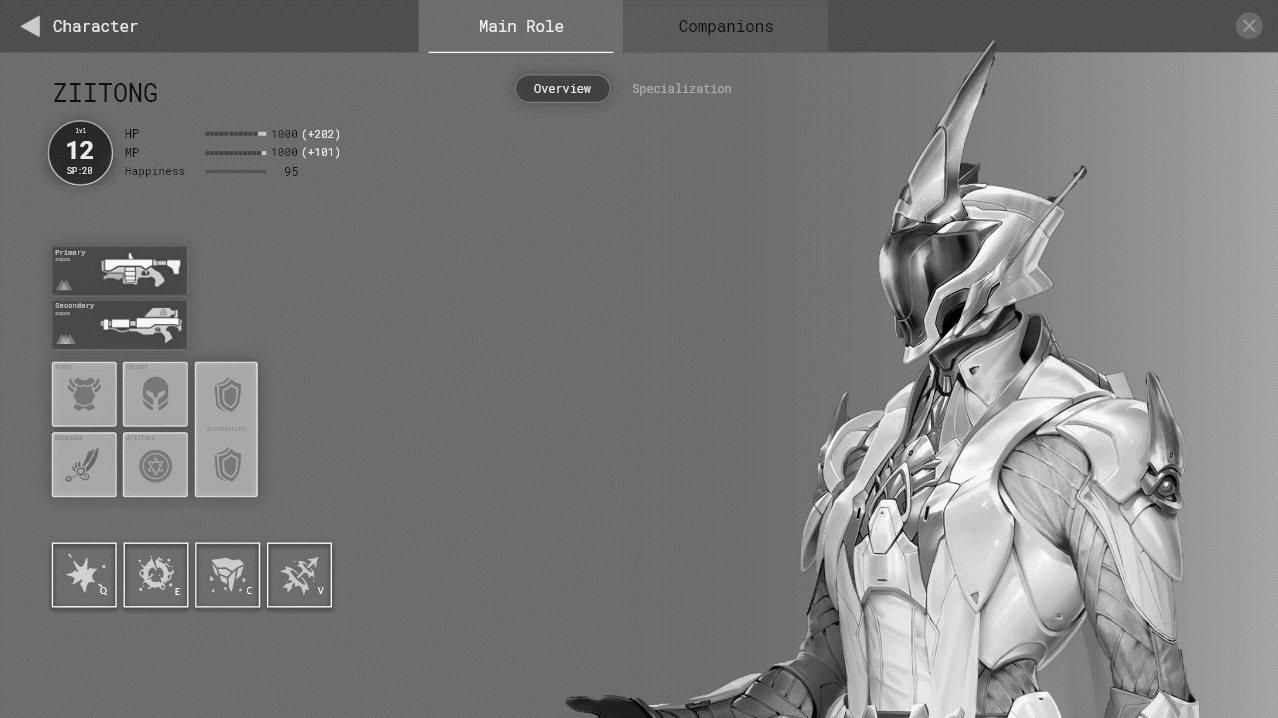
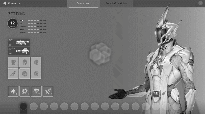
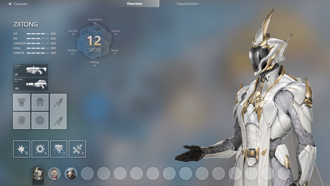
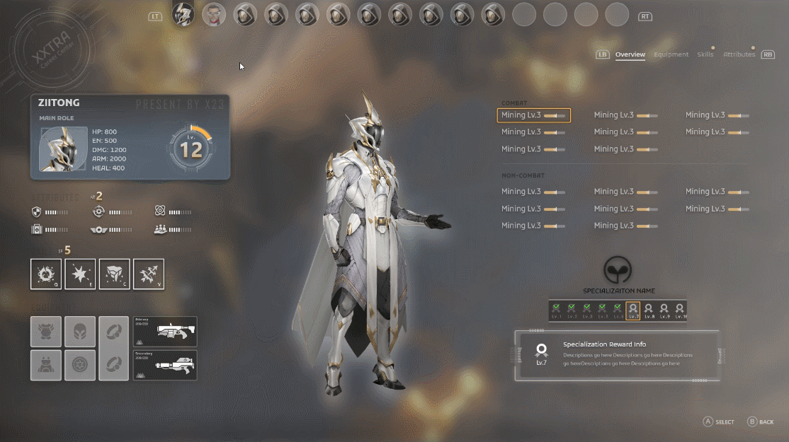
Part 1_Character Screen
One of my first tasks was to intergrate Mastery/Loadout/Skill Tree into one character page, the most diffcult part was to deal with the companions info at the same time, some of the mechanics are similiar but slightly different… It’s gonna be a massive and challenging task to do, but eventually we had a satisfying outcome, basically come up with the best solution for the most used interface and meet the requirements for players.
Will show serveral working process below, couple cases are not implemented in game at the end, cherry pick some of my favrites.ヅ
Page Transition Exploration

Iterations
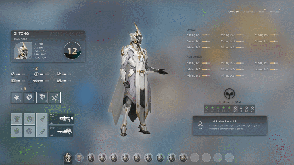
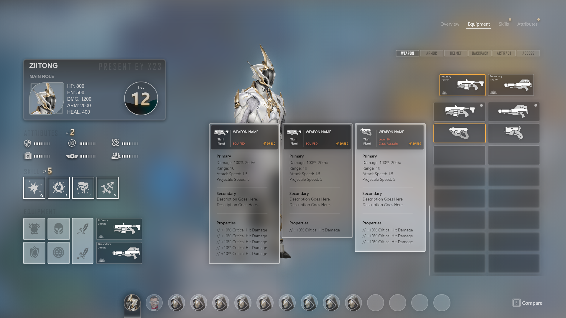
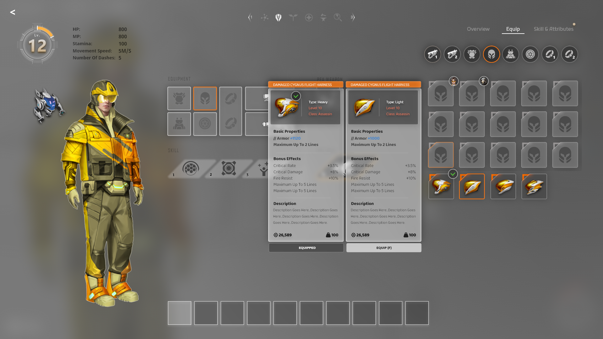
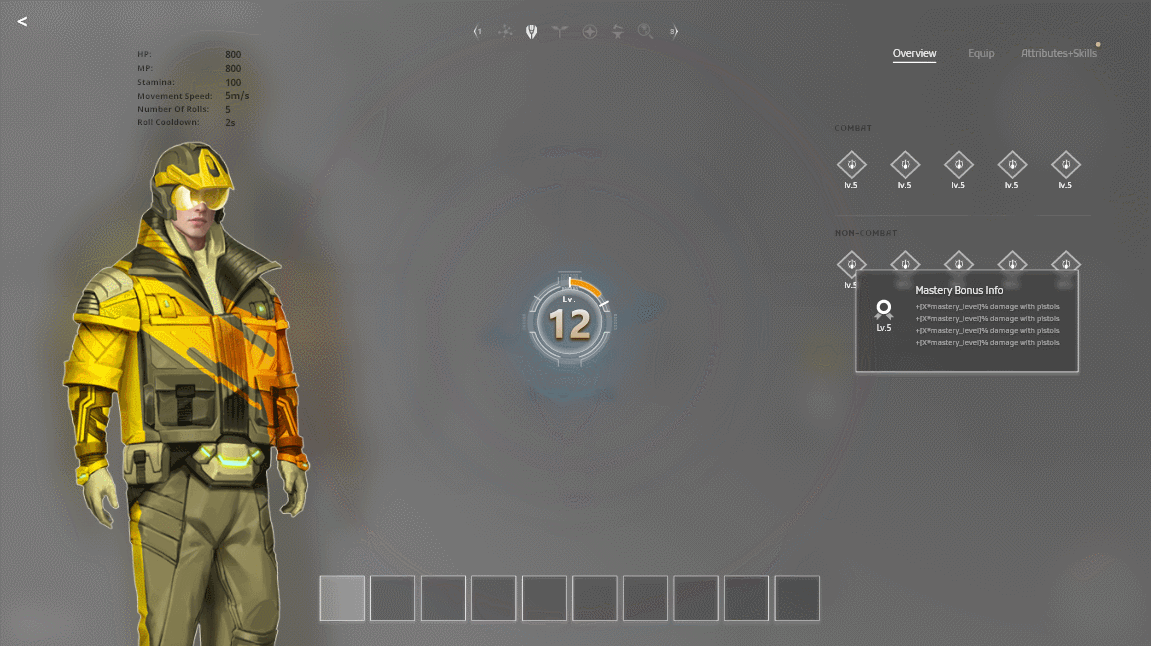
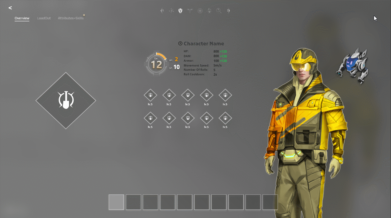
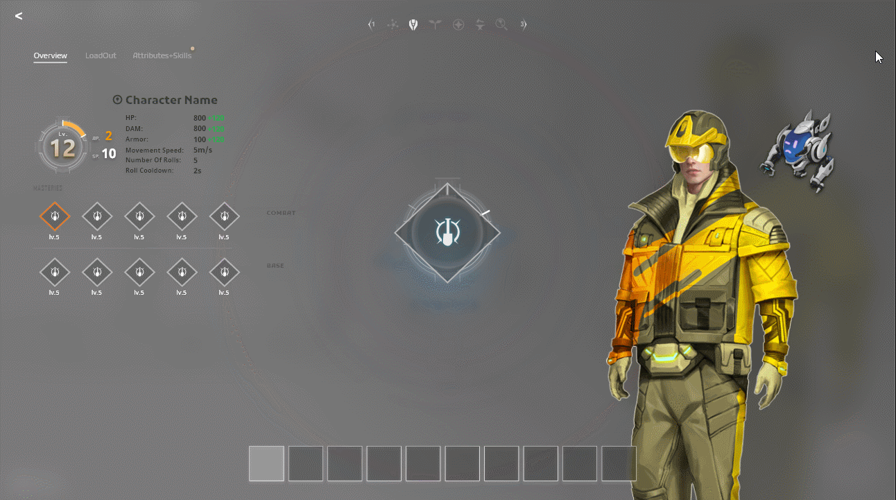

Loadout (Equipment)
Focus on the usability & compatibility for PC and cursor friendly. Sometimes we are not able to match all the demands at the same time, this requires UX designer make the compromasion according to the most important info hierarchy from a player's perspective.
Difficulty:
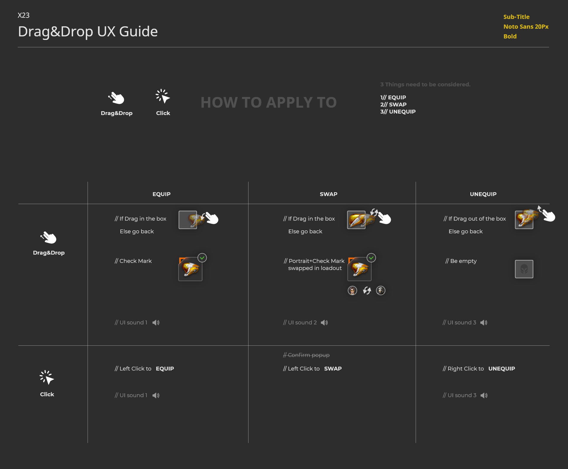
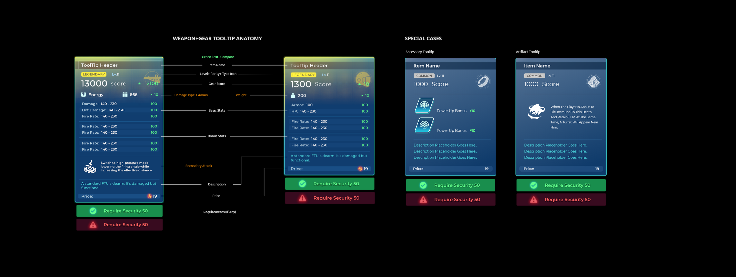
When a game comes to have party organization feature, how to swap equipment, compare between gears, sort out a perfect order for players to pick will always be a headache for developers.
Solution:
Put avatar at right top conner if equipped
No avatar, disappear whole component to individual slot if equipped
Both of them have pros and cons, 3 factors are involved,
Easy to compare
Easy to swap
Longer/shorter List
Option 1 has two benefits so far, decide to keep this way to give a shot.


👆Left side version_211124

👆Middle version_211207

👆Right side version_211208

👆After GUI Polish_220101

👆Eye tracking measurement
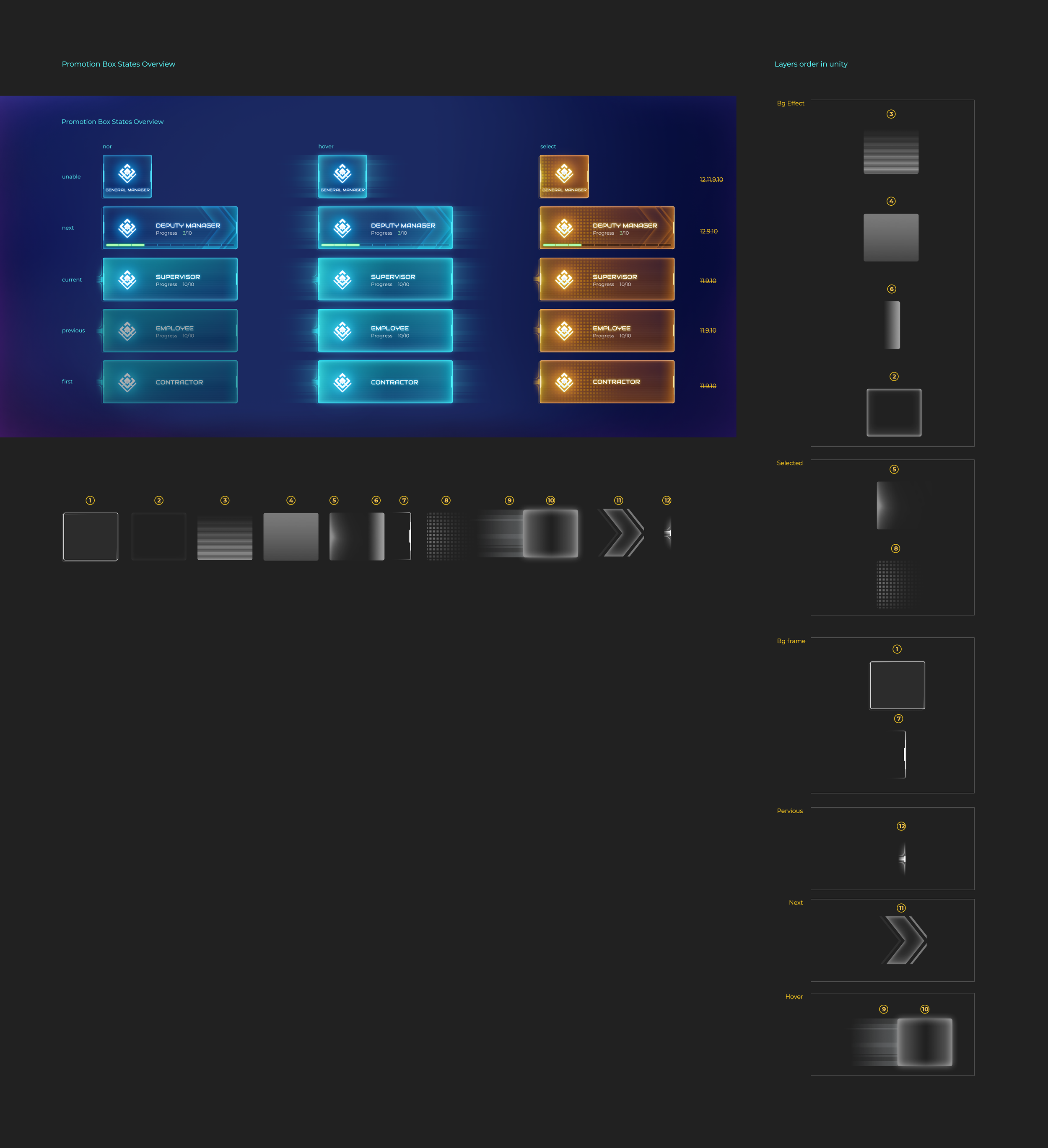
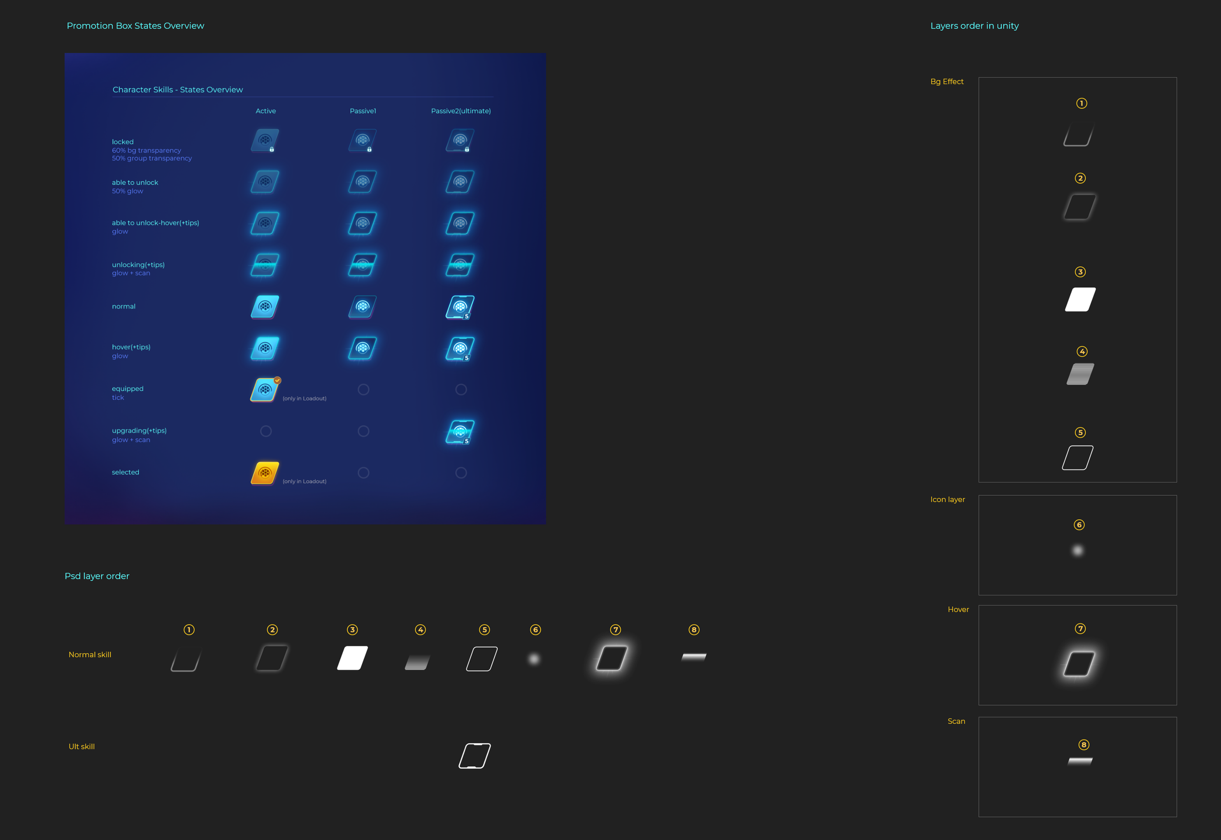
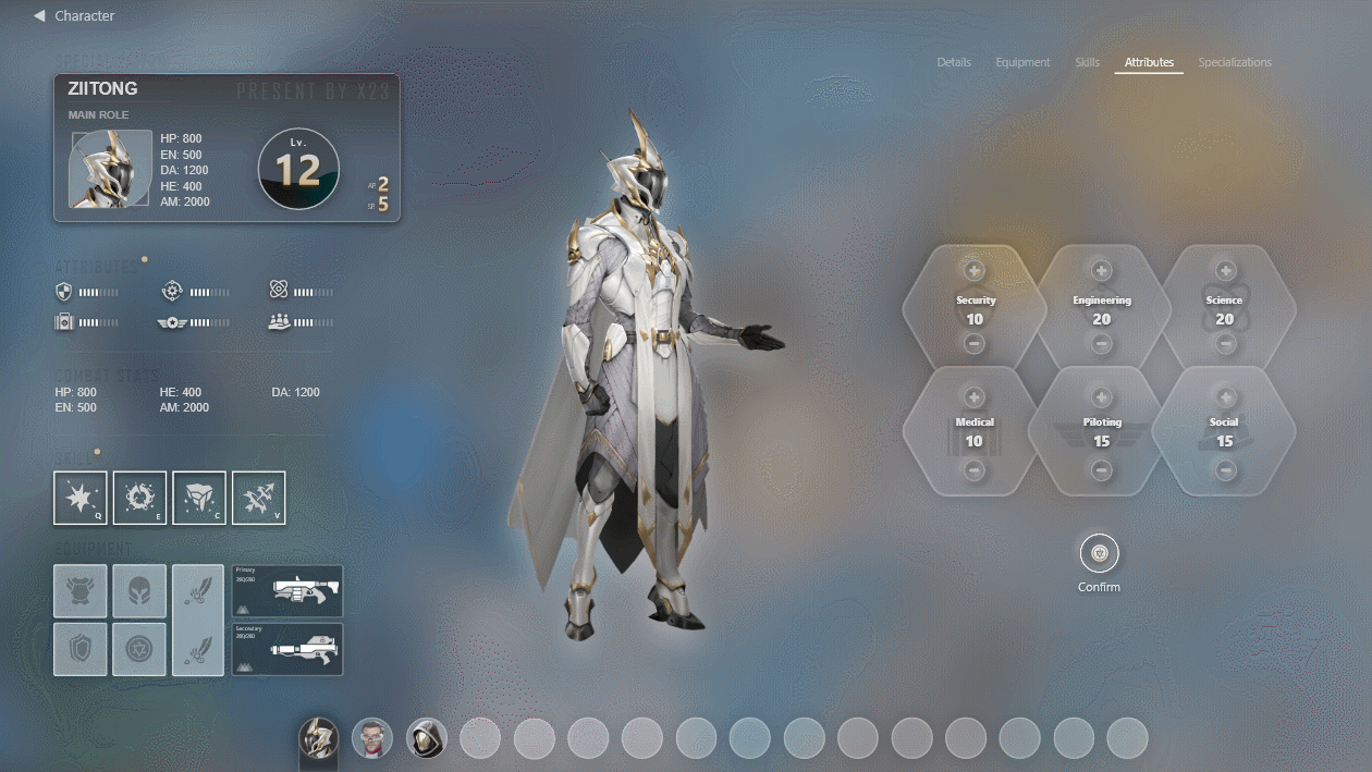
Attributes & Skill Tree
Aduiences' feedback is the key point for us to tweak more interactive details, hence we organized a oversea playing test before EA.
Difficulty:
Players reported it's easy to get lost if introduce two complex systems at the same page.
Solution:
We decided to split it into two parts, demonstrate the tutorial step by step, use WASD as hotkeys to switch back and forth between categories and two sections.


This is a comparison between mockup and implementation, make sure your design can be validated in a tangible way and get closer to what you exactly demonstrated is pretty significant for the UX designer.
👆UX Mock up ( In XD )
👆Final Game Effect ( In Unity )


Part 2_Combat HUD
Game is initially in early access stage, we still get much freedom to play around with the layout,
Additional gameplay keep changing, many design details need to adapt into new feature requirementsヅ
Difficulty: Btn states on HUD is generally more complicated than usual, which includes many special cases.
Solution: Write down all the situations within a logical way, trying to not miss any one of them and validate the thoughts.
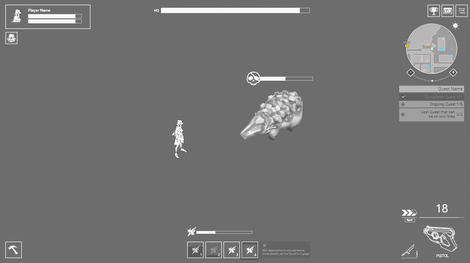
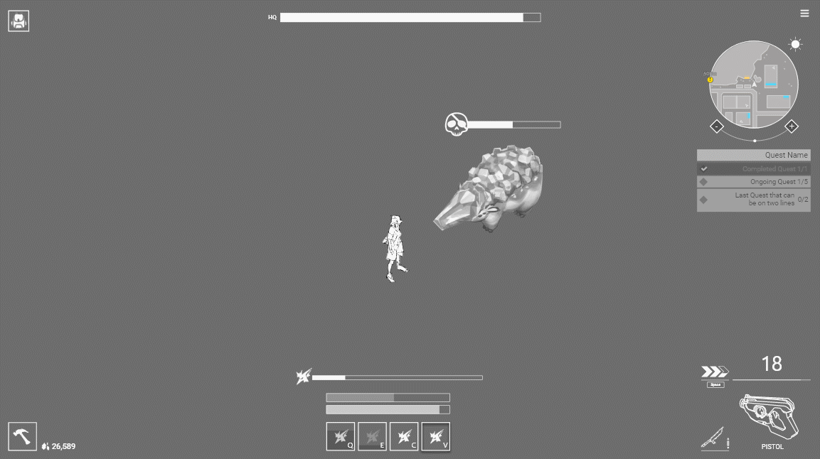
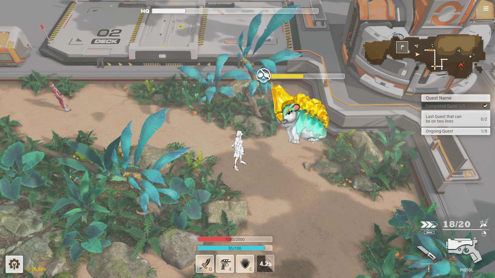

Combat HUD Breakdown
Previously, need to do base management and combat on one screen, according to turn base gameplay, we separate combat hud into an individual section.


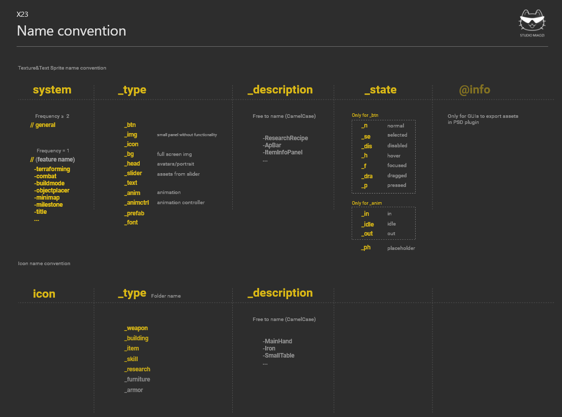
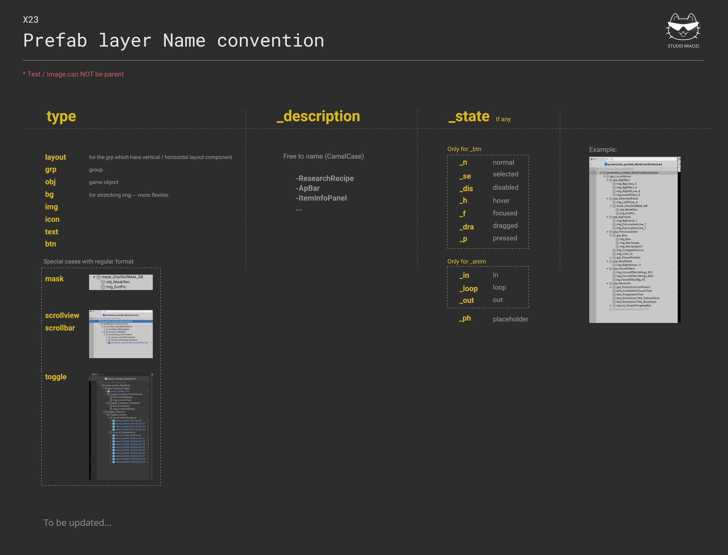
Extra Work_Design Convention
As one of the initial developers, clarify working flow + simplify pipeline is super essential, a concrete design convention can save a lot time for the whole team.